下载中心
先拿文件,再看规范。印刷用矢量。PPT 用母版。识别与网页各一份 Skill。
PYC = Power Youth Center
Three letters, one reading. The legal and public English name is Power Youth Center. The Chinese name is 动力少年 — it is a name line, not a second mark. Most stationery carries PYC only.
Keep
- E1 wordmark. Electric blue #015FFA.
- Neue Haas Grotesk as the Latin text face.
- Hollow pill buttons, tight tracking, ice wash.
- PYC as the only logo. No second crest.
Change
- Meaning: Power Youth Center, not an industrial house.
- Chinese sits to the right of PYC when needed.
- Letterhead, cards, PPT, email: English. Chinese is for the site, signage, and the bilingual lockup.
- Retired: gold PY crest, fruit 2×2 in the letters, stacked Chinese under the mark.
| Layer | Form | Where |
|---|---|---|
| Mark | PYC · E1 SVG | Everything |
| English name | Power Youth Center | Footer, first mention, cards |
| Chinese name | 动力少年 | Bilingual lockup, site, signage — not melted into P/Y/C |
| Parent | HSKB 博格港湾 | About, one footer line. Not in the mark. |
| Line | 180 0257 8387 · 0755-29903990 | Footer, contact |
Logo · E1
P and C are locked custom paths. Y is Neue Haas Grotesk Text Pro 75 Bold, outlined, scaleX 1.08, dropped 0.86. Never type PYC in a font.

Master · #015FFA · pyc-e1.svg

Ink · #231F20

Reverse

Badge · avatar / favicon
Clear space / minimum
Clear = ½ cap height. Screen ≥ 24px. Print ≥ 8 mm. Smaller: badge only.
What the mark is not
Not a crest. Not a cube. Not four letters. Not PY. The gold outline PY and the fruit 2×2 are retired from this system.
Lockup · name to the right
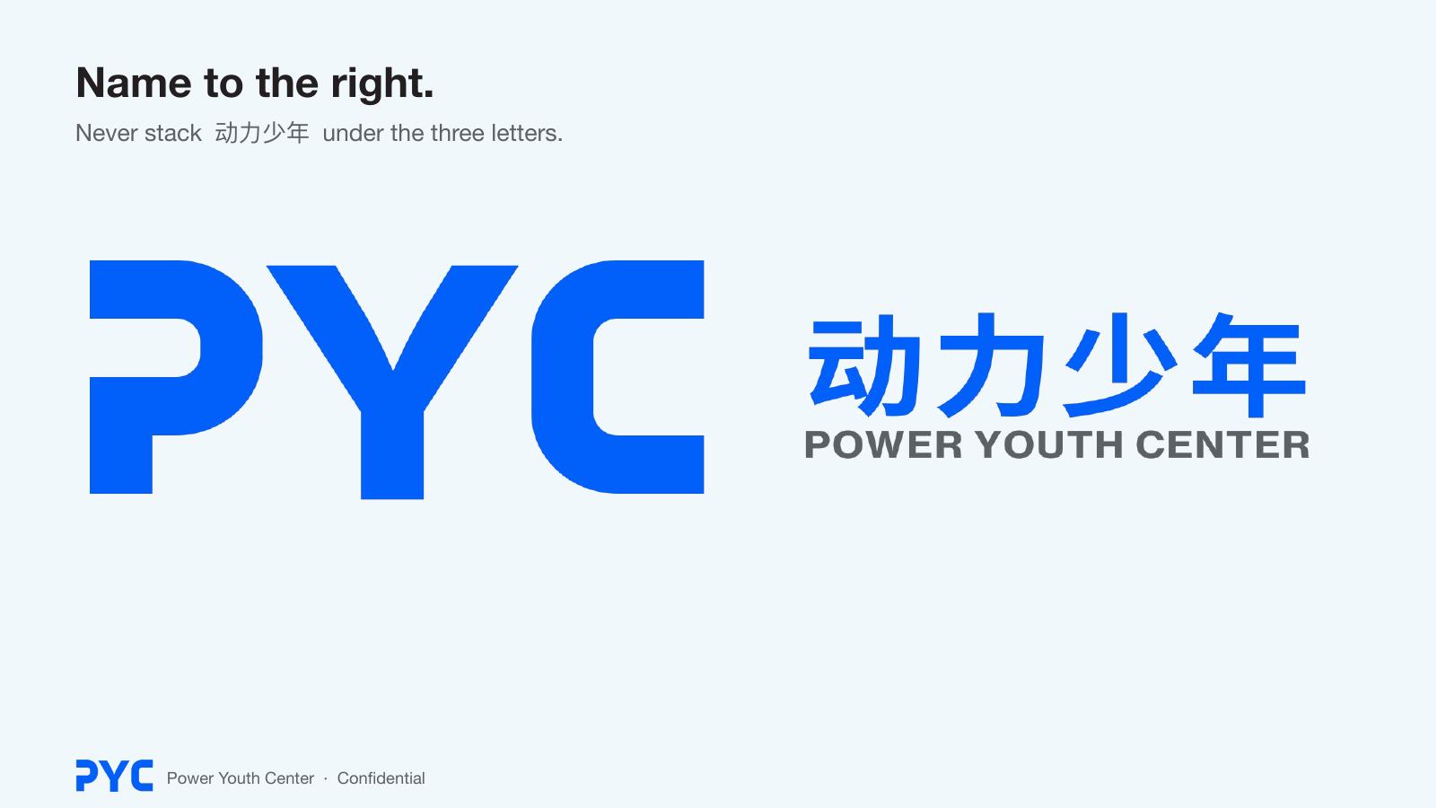
When the Chinese name must appear, it sits to the right of PYC, optically centered on the cap. English full name under the Chinese, same width. Never stack the name under the three letters — that turns 动力少年 into a second logo.

Master bilingual · lockup-h-blue.svg · Noto Sans SC Bold 700 + Haas 75
Ice / white

Ink reverse
Blue reverse

Document variant: mark in blue, name in ink. Certificates, proposals.
Do Name block to the right. Gap ≈ 0.4 cap.
Don’t Stack. The three letters lose the stage.
Chinese type
The family you have — Noto Sans SC / Source Han Sans — is the right family. The cut for the lockup is Bold 700, not Black 900. E1 is already extra-black. The name beside it must be the text face, the way Haas 75 sits next to a custom mark.
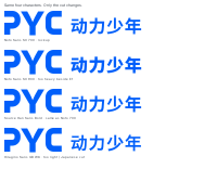
Same four characters. Only the cut changes.
Use · Noto Sans SC Bold (700)
- Same skeleton as Haas: even stroke, no contrast, no rounds.
- 700 is the Chinese equivalent of Text 75 Bold. It reports to E1; it does not compete with it.
- Tracking +50/1000 on the four characters. Left edge of 动 aligns to the name column, not to Y.
- SIL, web and print. Outline into the lockup SVG. Do not live-type 动力少年 in PPT.
- Source Han Sans Bold is the same drawing. Either file is fine.
Not the lockup
- Noto Sans SC 900 — correct family, wrong weight beside E1. Reads as a second mark. (That was the last version.)
- Hiragino Sans GB W6 — too light, Japanese terminals. Fine in body on a Mac, not the name.
- Heiti / 黑体 / 苹方 Regular — system UI. Too thin, or too 1990s.
- Noto Serif SC / 圆体 / 楷体 — book, kindergarten, homework. Never the name.
If you buy one Chinese face later: 汉仪旗黑 65/70, not 80/90. Same logic — text weight, not display extra-black.
Color
Electric Blue
#015FFA
Mark, links. Suggest Pantone 2727 C to proof.
Ink
#231F20
Name, body, button stroke.
Ice
#F0F8FC
Wash, cards.
White
#FFFFFF
Do not introduce a second blue. Do not fill buttons solid blue — blue is for the mark and for links. Fruit colors (Iris / Melon / Avocado / Citrus) and gold are not part of this system.
Type
| Layer | Face | Spec | Use |
|---|---|---|---|
| Logo | E1 SVG | — | File only |
| Chinese name | Noto Sans SC 700, outlined | tracking +50 | Lockup only |
| H1 Latin | Haas Text 75 Bold | 36/42 · −0.040em | Page titles |
| H2 | same | 26/32 · −0.030em | Sections |
| H3 / button | same | 17–22 / 20–28 | CTA |
| Latin body | Haas Display Regular (stand-in for Text 55) | 16/24 | English |
| Chinese body / H1 | Noto Sans SC 400 / 700 | 16–17 / 26–36 | Site |
| Nav | 75 Bold 14/30 | ink, hover blue | Header |
Then let the light out.
PYC is character education for students who are stuck — school refusal, pause, pace, family, peers. We do not write a diagnosis. We write a path.
Voice
Like PYC
- Short sentences. Person first, method second.
- Growth challenge, not a medical name.
- See, support, light.
- First mention: PYC (Power Youth Center). After that, PYC.
- Line: 180 0257 8387.
Unlike PYC
- Case-file tone. Exclamation. Motivational soup.
- Inventing a forced English expansion of PYC.
- Claiming Harvard / Yale as partners. Borrow method, not the name.
- Putting the parent brand in the mark.
01 Career
See the person before you grade the road.
02 Assess
See. Do not convict.
03 Brain
Body and brain before attitude.
04 Person
Heart, study, body, will, home.
05 City
One life, one project. The city is the classroom.
06 Pace
Back to school speed.
07 Paths
Open the road so a person can stand.
Book
Meet once. 180 0257 8387.
Website
Keep the live IA. Hang E1. Do not restyle into solid-blue buttons or a second mark in the header. Row 1440. Pill 1px ink, radius 30px. Blue only on the mark and links.
点亮心灵的晴空。
Character education for schools, government, and families. Stand the person up, then return to the rhythm of school.
Book a meeting
Home: claim → CTA → seven steps as a grid. Photography, not illustration.
Seven things at once, or you cannot hold a person.
School runs Life Navigation. Family runs Power Youth Center. Same seven steps.
/path
Meet once. Then talk about standing.
Nanshan · Qianhai · Bao’an · Luohu. Parents first.
180 0257 8387/contact
Map
Home · Path · seven method pages · Challenges · Family · School · Society · Institution · Experts · Academy · Six Years · Calm Growth · News · About · Contact. Footer: line, four addresses, Power Youth Center.
Print · English first
Letterhead, envelope, cards, folder: PYC only. The Chinese name does not belong on a letter. If a Chinese audience must see it, use the horizontal lockup once — on a cover, not in the letterhead corner.
Dear colleague,
PYC is character education for students who are stuck — school refusal, pause, pace, family, peers. We do not write a diagnosis. We write a path: see, assess, restore the body, stand the person, make one thing, catch up, open the road.
Letterhead · US Letter / A4 · mark top left · English body · footer name + domain
Card 89×51 · white information · blue brand. No Chinese on the reverse.
#10 envelope · mark top left
When Chinese is required
Cover of a Chinese proposal, a certificate, a site header next to the mark: lockup-h-blue.svg or lockup-h-blue-ink.svg. One use per surface. Do not also set 动力少年 as a headline in 900 underneath.
PPT
Stand the person up. Then let the light out.
Seven steps at once
Growth challenge, not a file.
Book a meeting
- Cover: blue + reverse mark + one line.
- 16:9. Footer: mark + Power Youth Center. Do not repeat a giant logo every slide.
- Charts: blue + ink + ice. One extra grey if needed.
- Master holds SVG. Never type Y.
Digital
Guo Danrui
Project DirectorPower Youth Center
- Signature: mark + name Bold + title Roman + phone. No icon wall.
- Avatar: badge or reverse E1 on blue.
- Cover / WeChat: horizontal lockup on ice, or E1 alone.
- Favicon: badge, square crop.
Kit
应用用矢量稿,不把字标贴进生活照。服装只放小 E1。横锁标给页眉和展架。
白 T · 左胸 38–45 mm
帆布袋 · 袋面居中,约 80 mm
点亮心灵的晴空
X 展架 · 上锁标,中主张,下字标
PPT 母版
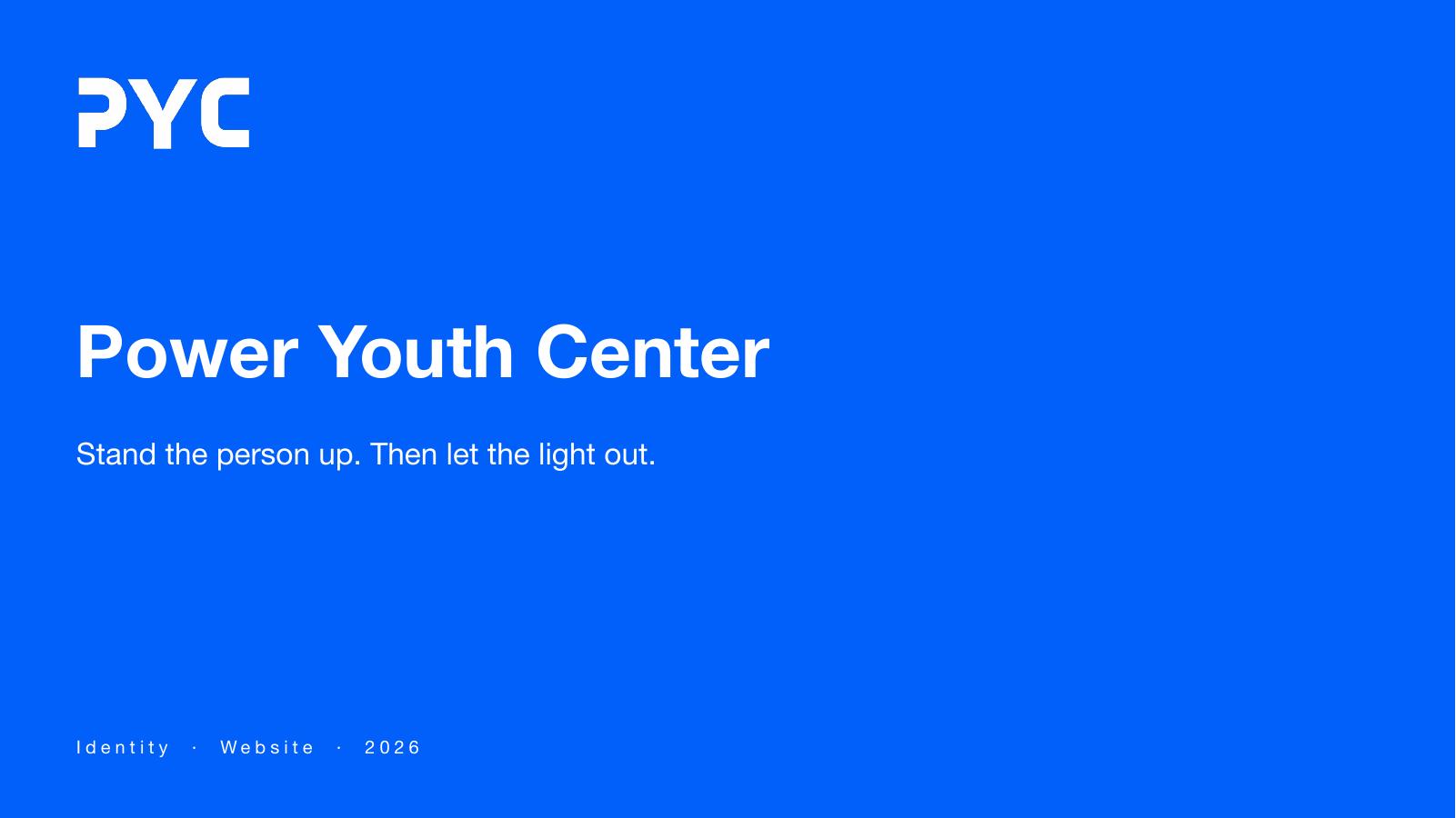
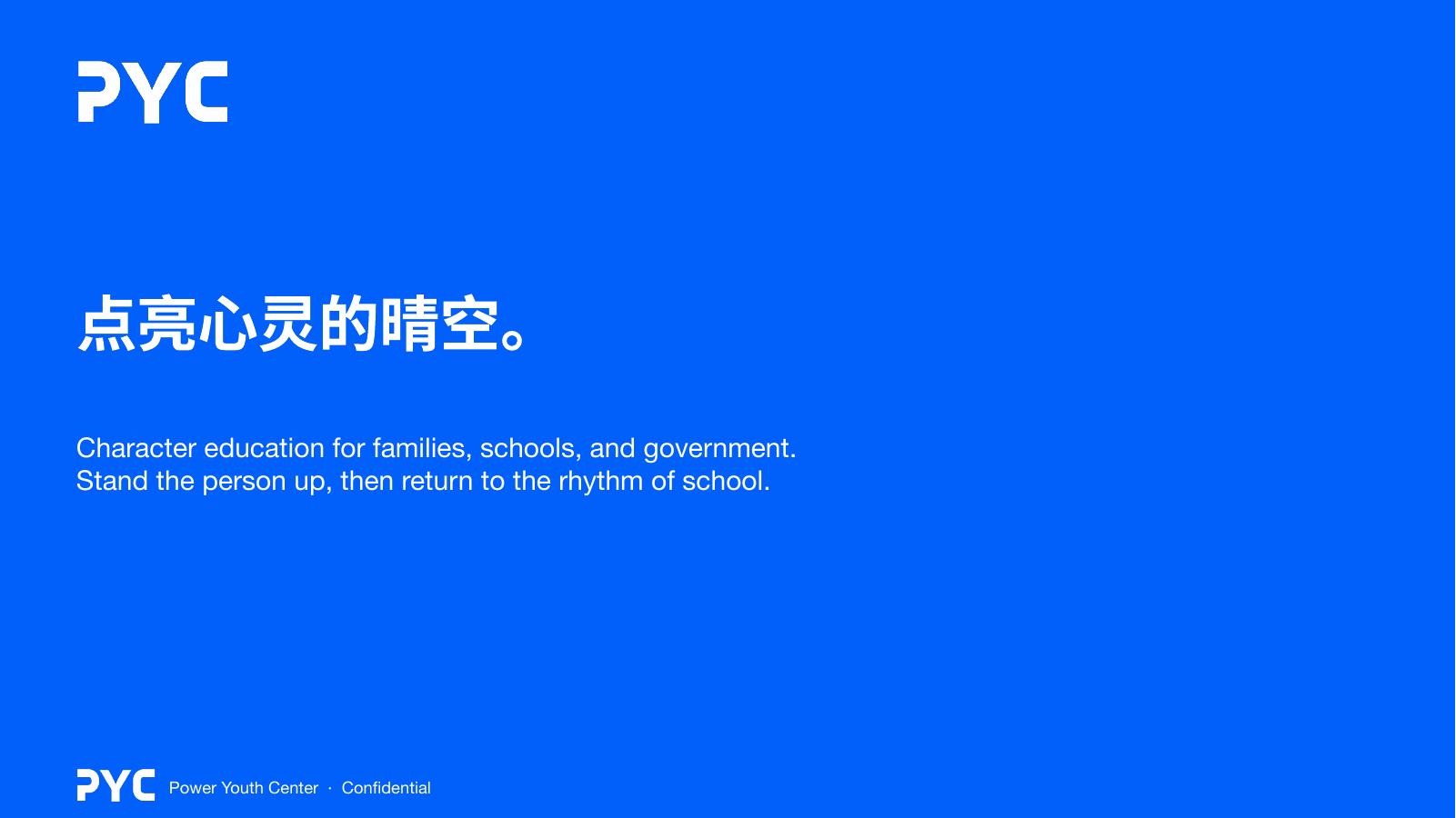
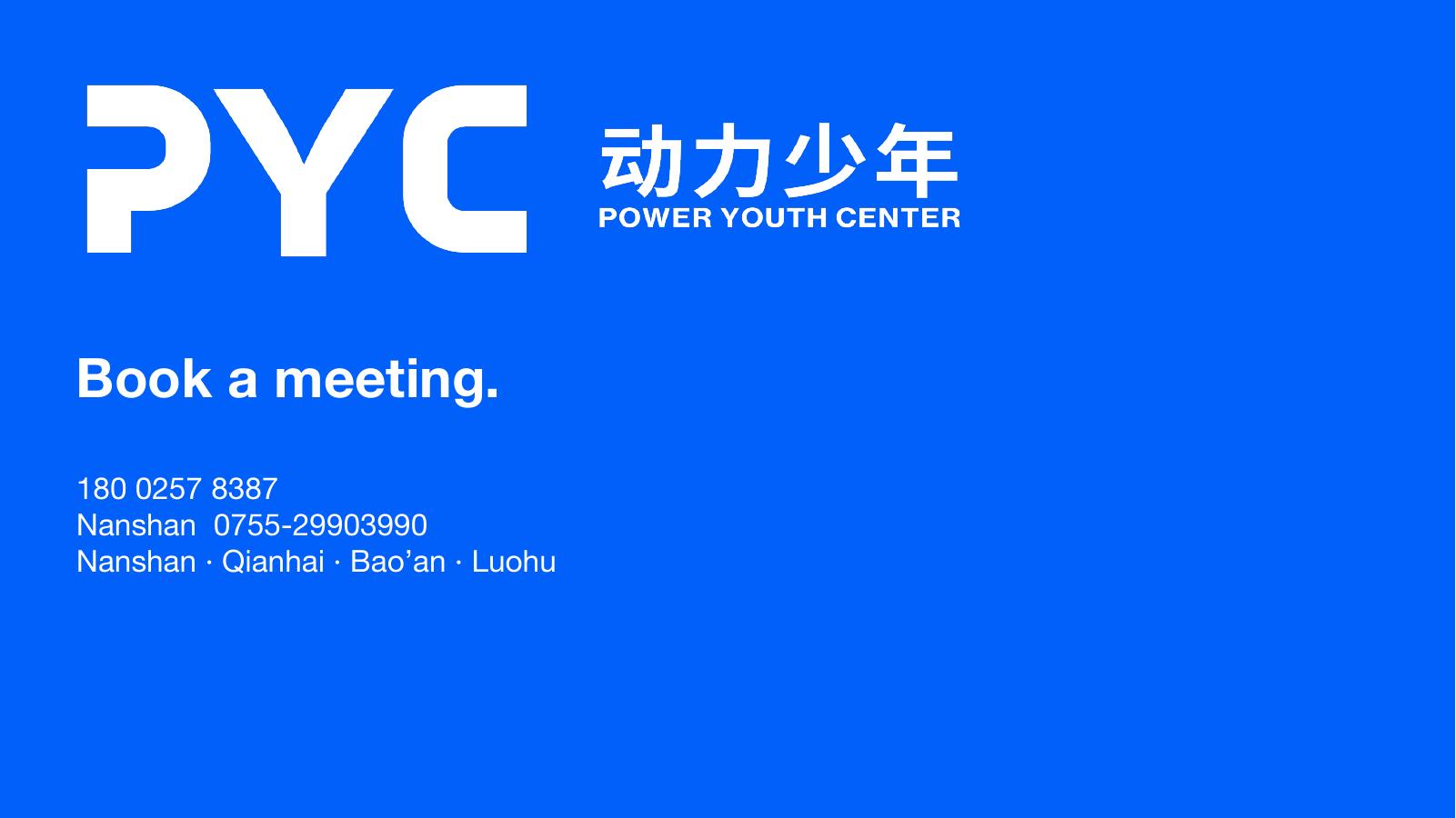
完整 10 页在下载中心
网站
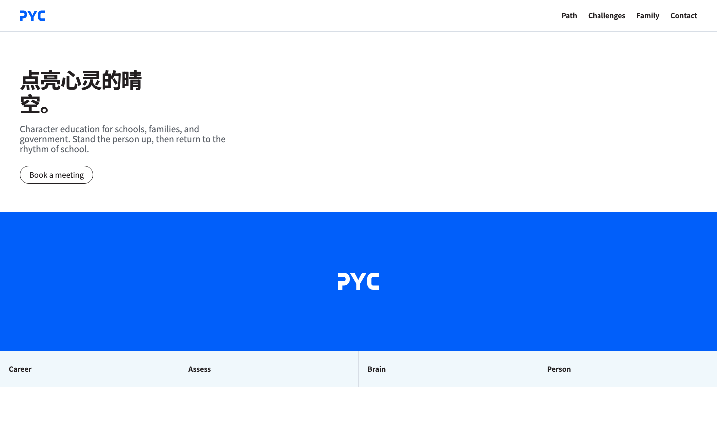
顶栏 E1 · 一句主张 · 空心胶囊。线上:/pyc-2/
Photography
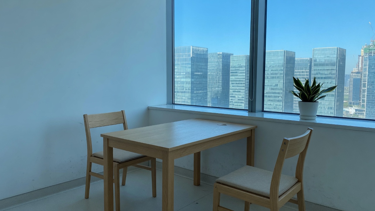
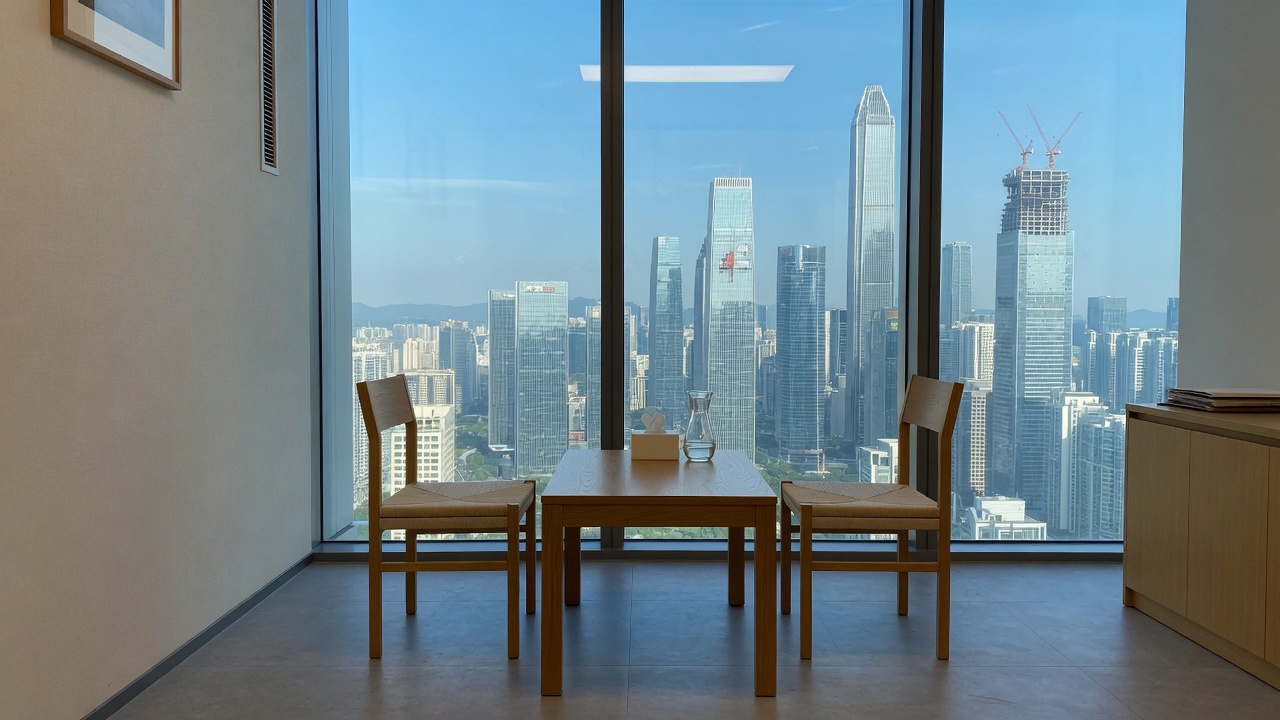
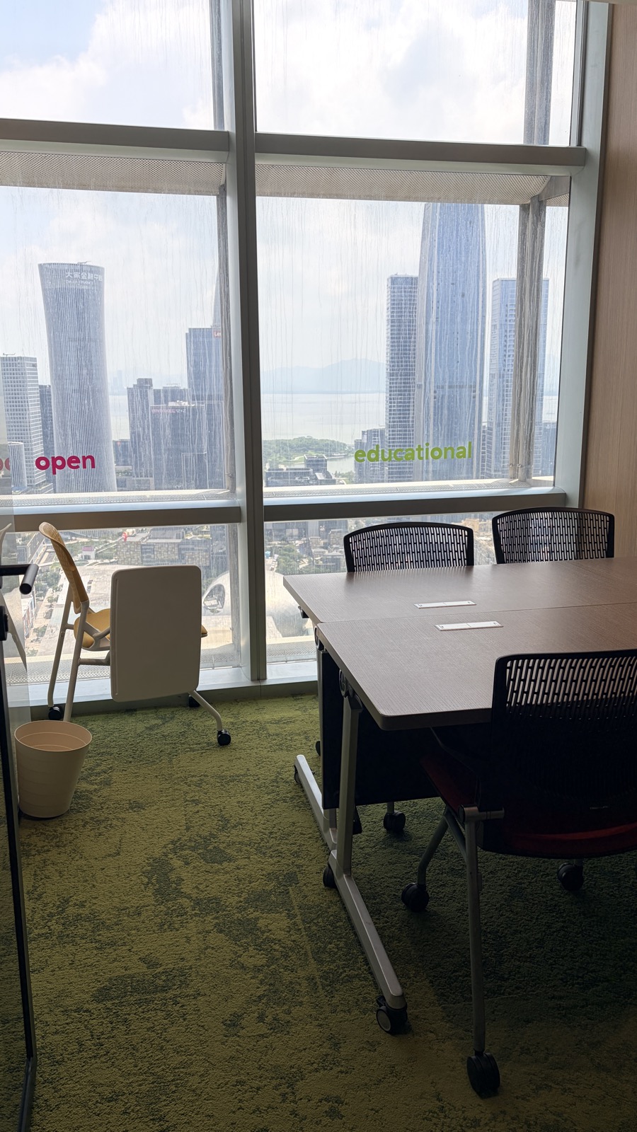
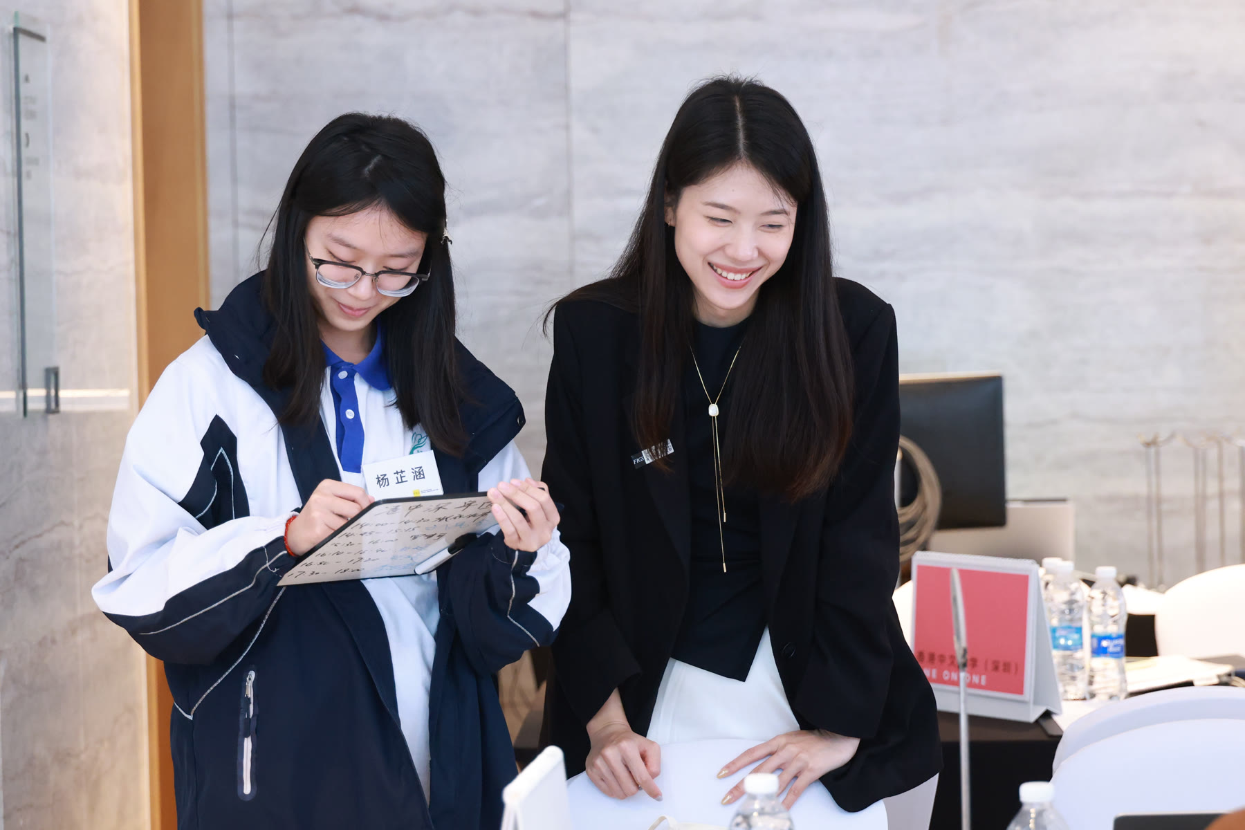
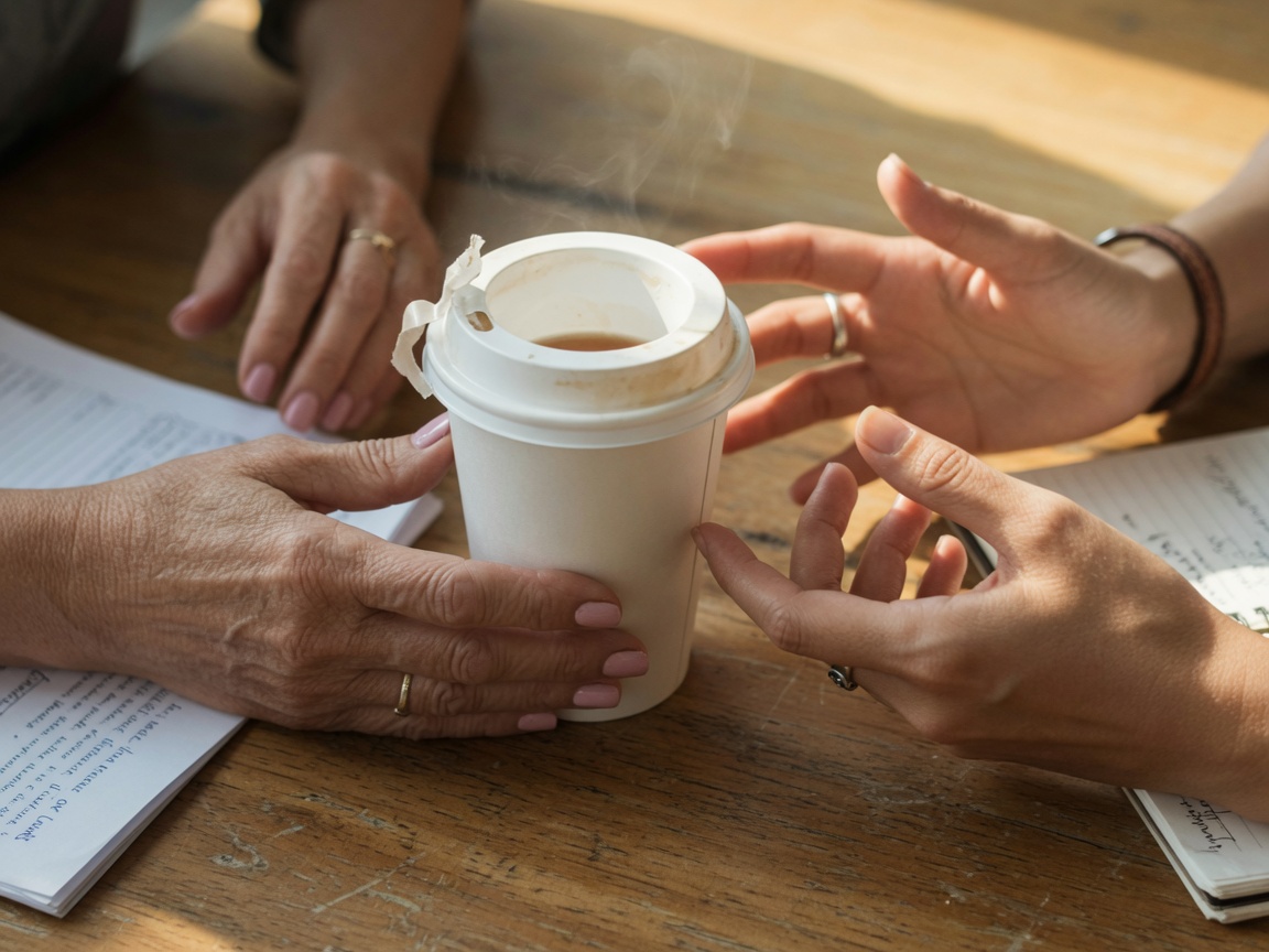
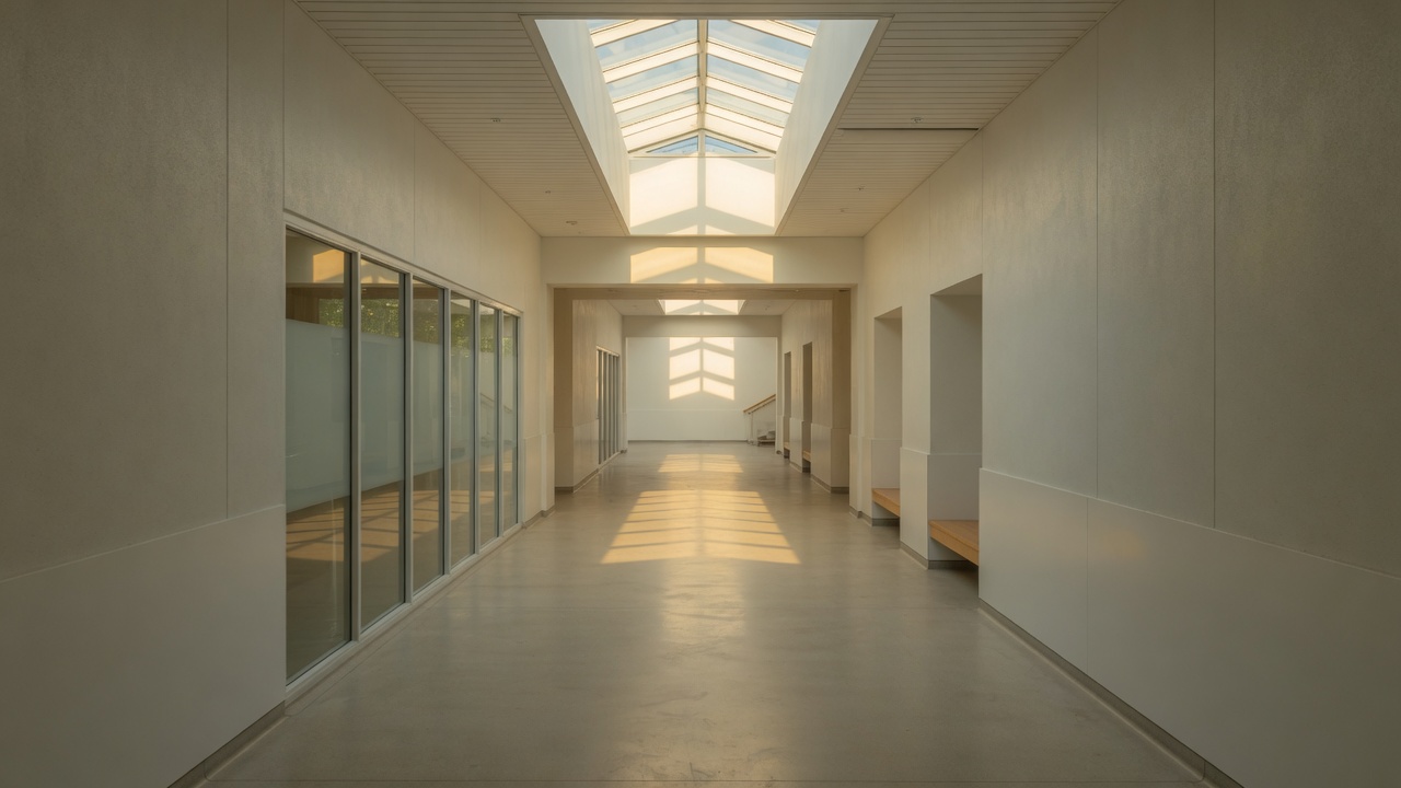
Rooms, window light, sky, the city as classroom. No hospital. No crying close-up. Sky is the claim, not a sticker.

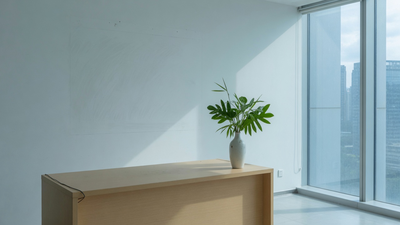

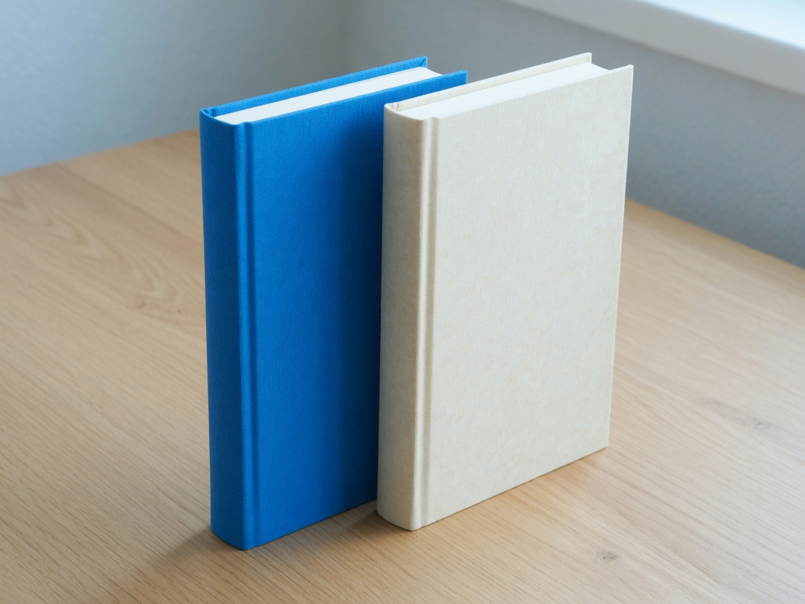
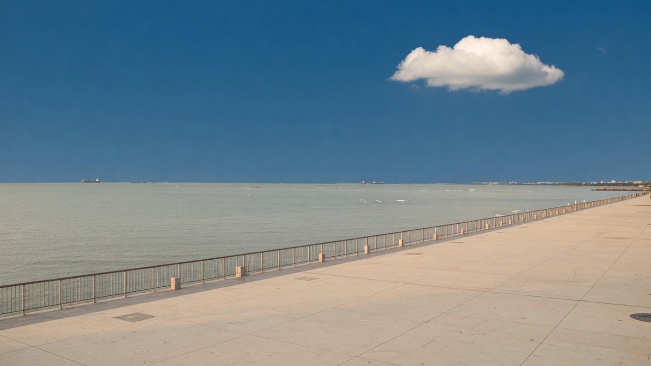
Do / Don’t
Do E1, proportion locked.
Don’t Skew, shadow, outline.
Do Reverse file on blue.
Don’t Blue on near-black. Contrast dies.
Do Name to the right.

Don’t Black 900 as a twin mark. And never stack.
- Do not retype PYC in any font.
- Do not melt 动力少年 into P, Y, or C.
- Do not bring back the gold PY crest or the fruit cube.
- Do not CSS-invert a light file for a footer.
- Do not fill the pill button solid blue.
- Do not put Chinese on the letterhead if English will do.